On rolls of paper our Foundation group started mini abstract compositions all over the paper by using a variety of techniques and materials, for example splattering ink, layering acrylic and mark making with chalk, charcoal and oil pastel.


After we finished creating our free-flowing group piece we took a step back to reflect on what we had created. By doing this we took a camera and zoomed in on smaller compostion parts out of the composition to pick out parts that all found individually interesting.


We then took those photos into Photoshop and manipulated them -While in Photoshop I learnt how to take colour out of white areas by reducing the colour saturation in the white areas and adjusting the levels.


We then took those photos into Photoshop and manipulated them -While in Photoshop I learnt how to take colour out of white areas by reducing the colour saturation in the white areas and adjusting the levels.
When we had finished in Photoshop- As a group we looked at the smaller compositions and stated to make a new one with the parts we found interesting.


When we had made a final decision on the composition we had made we started to paint it on a large piece of canvas - we first made a pale blue wash that was our background and then we started to create the circle pattern on top of that. After doing that for some time we experimented by using ink with the acrylic to make the swirly circles look more colourful.


When we had made a final decision on the composition we had made we started to paint it on a large piece of canvas - we first made a pale blue wash that was our background and then we started to create the circle pattern on top of that. After doing that for some time we experimented by using ink with the acrylic to make the swirly circles look more colourful.
As we finished the background we started the main feature - the jaggered black and orange tornado - we used various techniques when applying the paint, including patting with a brush and hands, splattering it and painting in jaggered/messy patterns.


To make the black look as harsh I learned that you add blue or red to it so it doesn't look as jarring against other colours - we added blue ink to the left and red ink to the right and patted it in with the black acrylic and then the ink was left to splatter and trail away into the background which had a nice effect.


However I thought after using the same technique to apply the ink I thought the piece looked a little flat and also a too dark and needs something that lifted/lightened it up - so we looks at work by artist John Martin and Turner we saw how they used light and brighter colours to emphasise a certain point in their work, which draws the viewer to that point before they view anything in else in the piece.
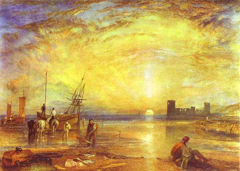 |
| Flint Castle - William Turner 1838 |
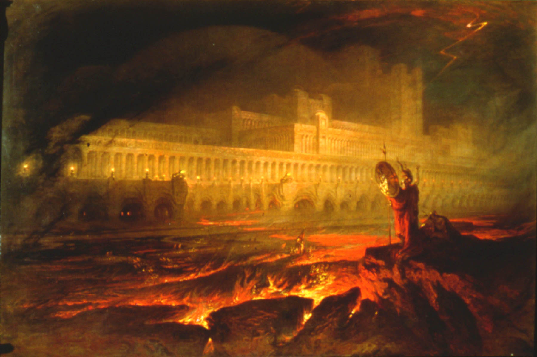 |
| Pandaemonium - John Martin 1825 |
For example Martin's "The Destruction of Soddom and Gamorrah," the brightest parts are in the top left where (western) viewers would start to look. So Martin had painted this part brightly so it attract's the readers attention and then it blends out to the other parts of the painting which we then look at.
 |
| The Destruction of Soddom and Gamorrah - John Martin 1852 |
We took inspiration from this particular part of this painting and after stepping back from our work and reflecting on what we had done so far - we decided we needed to brighten the piece up so it didn't look so flat and dull. So to lift up our piece we decided to add more white and yellow since it was too dark/had too much red.

Also by standing back and looking at our work we thought that the piece had become more of a portrait piece than landscape which we had originally intended. We also reflected on the idea of the piece not being as abstract as our first idea was - and started to create a forest/woodland sort of landscape.

A week later.....
With fresh eyes we pinned our piece up on the wall to view it as we would if up was hanging in a gallery and I found that I liked it a lot more than before - being able to see it form that perspective really made the piece able to communicate its narrative.

With fresh eyes we pinned our piece up on the wall to view it as we would if up was hanging in a gallery and I found that I liked it a lot more than before - being able to see it form that perspective really made the piece able to communicate its narrative.
We then decided to add more blue in and to the bottom to make it look more like the river that we had now chosen to see in our piece. So the blue ink didn't look so harsh we sprayed it with water and added splashes of white acrylic to make it look softer. Also as a group we decided that the top left hand corner needed some colour - this was because when we took a step back we found that this corner seemt too jarring and we found that splashing some white and yellow made the black section look more connected to the rest of the piece. We also splashed the yellow and white in the centre - which we thought also was needed to just lift the bright colours of the "forest fire."


The final finishing touches came from James who suggested we have something in the sky - a moon - we really like the idea since it would tie the top half of the piece together, also after adding more detail to the bottom half of the piece - the top half didn't seem as interesting. After debating on where the moon should be placed its final place was decided to be on the left rather than in the centre or to the right. I personally thought that it balanced the top well since the left had the dark "mountain" and the right would have the light moon. Also when the moon was painted on we decided that using a sponge/cloth to apply it - this soft technique was much better than using, for example a paintbrush to create a swirl pattern since it would blend in too much with the "sky" background.

With the addition of the moon, we again stood back and looked at our abstract piece and declared it finished.

The final product was 100 times better then I thought it would turn out - I was sceptical to being with since I wasn't the biggest fan of the original composition, this was because I am not really someone who goes for the abstract sort of work and I found it really challenging to try and just go with the flow to this abstract design. But I thought that combining thoughts with the rest of the class made me feel a lot more comfortable about it.

No comments:
Post a Comment