Our first project brief was to create a poster in the style of War propaganda - looking particularly at the World War Propaganda and Eastern European style of propaganda - so to engage the viewer within 2-3 seconds. This included bold and persuasive text, striking colours and a powerful image/s.
The purpose and content of this poster was to highlight the amount of opportunity for graduates within the creative industry, also the poster should reflect the contribution the creative industry has on the economy.
Research and Designs
I started the project by collecting some information on the creative industry and its impact in our economy and society - I read an article by an education reporter, Judith Burns called "Multimillion-pound training pledge for creative industries." This was a very informative article and provided a substantial amount of information that I could use help create a eye catching tagline.
But for a little more research into style of propaganda posters I also looked at styles from countries such as Japan, China and Korea. However I found that they had an more elaborate illustrations - unlike the European styles which were more bold and striking.
Also a common feature that I found in many of the propaganda posters was the Japanese rising sun pattern. So as I made my first designs used this pattern as starting point and made multiple designs and based on that pattern.
Images
I had a few problems acquiring
good images that could effectively communicate the message I was trying to get across.
My first design would have required a large group of people I used an image off
the internet as a placeholder until I was able to take a suitable image –
however in the short time scale we were given to complete this brief I didn't acquired
a picture but this prompted me to try a different design.

The second design I also had
trouble sourcing original images since there was so many images that I needed
so after a while I gave up on it – but I went back to it after I had finished
my final design for some more practise with Photoshop (which I still desperately
need.)
 |
| Rising Sun Inspired Design |
After taking a step back from the
designs that I had done I did some more research on other types of propaganda
posters and I liked the posters that had a clear simple image but was designed
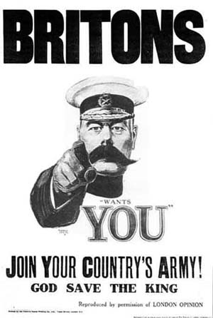
in a way that was very impactful, for example the “Army Needs You Poster.” Also I loved the propaganda posters that had a fist image since it gave off a feel of being really strong.




So to start my design I took a picture of my hand holding paintbrushes, pencils and pens in a fist and used that as my main image – I cut the image out and changed the colours palette in Duotone and added a slight filter Cut-out to the image to make the image look slightly more rugged.
 |
| Original Photo |
 |
| Cut-out, Curves and Grayscale |
After cutting out my hand I put it on the Rising Sun background that I had made and added the text - but I thought there was something missing in the piece. So i tried to find ays of making the poster look more vintage so it capture the war propaganda feeling more - I added a picture of crumpled paper as my background and used the Layer Style to fade the paper background into the rising sun background, I really liked this effect as if looked as if the poster had been folded/was fading from the weather.
However I wasn't entirely please with this final design - I liked both the fist and the background seperatley and I thought the font didn't really add to this piece, I also when I stepped back and looked at this piece I didn't find it very impact fully and overall i wasn't happy with it. It was a good attempt but I think my ideas for this work had finally started flowing and I was getting more comfortable with this brief and using Photoshop a bit more - So I decided to start from scratch. AGAIN!
I still wanted to keep my hand idea but I thought of changing the background - so I looked back at my research and looked at other background that were popular and thought that a safe bet would to use our nations flag, since that has always been I sign of national pride and I thought it would be an impactful image to use. So with that in mind I had a look around and make a quick version of the new design - including the Union Jack and a fist - with images from the internet.
I loved how impactful this was and mad my mind up to defiantly make a new poster with this design.
After completing my design (again) I used an image of a Union Jack as the background an fade it with another plain red background – at the end of this product I was very dissatisfied with it (again), it was all pixelated and the background wasn't nearly as good as I had pictured in my head - I was really ready to give up at this point.
 |
| Using the Layer Style to Fade the Layers |
 |
| Final Product |
I still wanted to keep my hand idea but I thought of changing the background - so I looked back at my research and looked at other background that were popular and thought that a safe bet would to use our nations flag, since that has always been I sign of national pride and I thought it would be an impactful image to use. So with that in mind I had a look around and make a quick version of the new design - including the Union Jack and a fist - with images from the internet.
 |
| Rough Draft/Mock Up of my Idea |
After completing my design (again) I used an image of a Union Jack as the background an fade it with another plain red background – at the end of this product I was very dissatisfied with it (again), it was all pixelated and the background wasn't nearly as good as I had pictured in my head - I was really ready to give up at this point.

But I persevered and I started from scratch again –
the same design but this time I drew out the Union Jack in Photoshop so to get
the best image possible and also to be able to use my own original image.

I was really pleased on how it looked and I also re-cut out and edited the hand to get a better quality image.

I was really pleased on how it looked and I also re-cut out and edited the hand to get a better quality image.
I played with
both Curves and Levels to make the Union Jack look a little dark and more
rugged so it gave the impression as other vintage war posters, this turned out
to be a good move as it made the main image stand out more and look more
impactful. Also since I really wanted to capture that vintage look so I added a
background layer to of an image of crumpled paper and used the effect to faded
layer in with the Union Jack layer to make it look old and
faded/rubbed/crinkled.

Text and Typography
Choosing suitable text for my poster proved to be more difficult - from the research article that I had read I had found out some small snippets of information about employment in the creative industry which could possibly be used to create a persuasive/moral boosting tagine to encourage the viewers to pursue a career in the creative industry. Some tagline ideas:
1. "Constantly changing. Constantly growing. Join 2 million others in a £71 billion a year."
2. "Creative Arts Want You! £71 billion industry. 2 million jobs. What are you waiting for?
3. "Creative Industry NEEDS YOU. In a £71 billion industry that keeps growing! Choose a creative career today!"
4. "Creative industry provides 6% of U.K domestic productions. Join the industry today!"
The tagline proved more difficult than I originally thought but I wrote down loads of various tag lines to try to and create an eye-catching which clearly communicated a positive feeling about the topic. I eventually settled on something simple:
“The Creative Industry Needs You! Join the £71 Billion Industry That Keeps Growing!”
I thought that this tagline would draw the reader in by directly addressing it to the reader and then using a persuasive fact at the bottom, then like the war propaganda photos I wrote a little paragraph at the bottom that informs the reader a little more about the subject that this poster is talking about.
“The creative industry ranges from adversity to architecture, fashion to film and is the fastest growing sector in the U.K and is considered “A powerhouse within the economy.” It provides 6% of the U.K’s domestic products employs over 2 million people and looks to educate 1,320 at degree level and update the skills of 1,000 others who already are in the industry. “IT’S NOT JUST A HOBBY.”
Just like the tagline, I aimed to persuade readers of the benefits of the industry and I think by having a small paragraph at the end of this would ensure that.
Choosing a typography that was clear and aesthetically pleasing was hard since I wanted it to be bold but also clear to read, impactful but not too domineering – also choosing black is a colour that sticks out for the viewer to read. But since the colour still was unclear due to the background, I added a white trim around the letter so there would be no confusion when reading the poster.
After finalising my text and typography I thought I was finished, but instead I thought the Union Jack filled the background too much and made too ‘busy’ so I played around with the position and angle of the Union Jack, so to increase the clarity and aesthetic impact.


The Final Product
Have you identified a fact or
positive of the Creative Industry that you have visual communicated?
I believe have meet the design brief criteria and have produced a poster that communicates them effectively - in the text I identified a positive fact of the creative industry and I used the the imagery of a fist holding paintbrushes etc to communicate a strong and positive image of the creative industry, also by having the Union Jack as the background I think it has more visual impact.
I believe have meet the design brief criteria and have produced a poster that communicates them effectively - in the text I identified a positive fact of the creative industry and I used the the imagery of a fist holding paintbrushes etc to communicate a strong and positive image of the creative industry, also by having the Union Jack as the background I think it has more visual impact.
I really struggled on having a final decision on the typography - but I think having a white glow makes the text stand out and be able to be seen rather than getting lost, also without the outline on first glances you only see the hand and the text isn't clear to see which is what I want it to be. Also having the bottom paragraph in black and not any other colour would make it appear to harsh and agin attract attention way front the title/tagline and the main images which is what I want the viewer to see first.
I think my design became more balanced and visually engaging when I moved the position of the Union Jack around, like I said before, by having the whole of the flag as the background it made the design too busy and drew too much attention away from the main image and the text. So I think by moving it and allowing some of the white paper background to appear defiantly balanced out the work and didn't make it too much for the viewer to look at.
I think my design became more balanced and visually engaging when I moved the position of the Union Jack around, like I said before, by having the whole of the flag as the background it made the design too busy and drew too much attention away from the main image and the text. So I think by moving it and allowing some of the white paper background to appear defiantly balanced out the work and didn't make it too much for the viewer to look at.
 |
| My Final Design (At Last!) |

No comments:
Post a Comment